Using the AI usage dashboard
The AI usage dashboard gives you a clear view of how your team uses Hiver AI across all your Shared Inboxes and the time saved by doing so. You can use it to:
- Identify high-impact AI features your team finds valuable
- Quantify time saved and share it in reviews or leadership updates
- Spot underused features and encourage usage
Prerequisites and availability
- The AI usage dashboard is currently available as part of an early access program. To enable it for your account, contact support@hiverhq.com.
- Usage data appears only if your team has used at least one Hiver AI feature in the last 60 days.
How to explore the dashboard
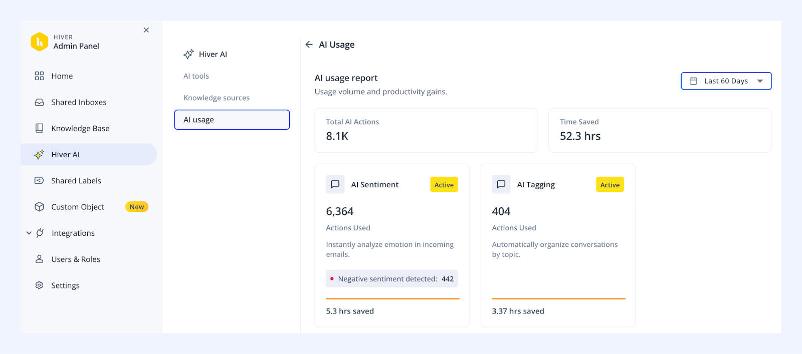
You can find this report by going to Admin Panel → Hiver AI → AI usage.
By default, the dashboard shows data for the last 60 days. However, you can switch the timeframe to 30 days or 90 days per your preference.
Overview metrics
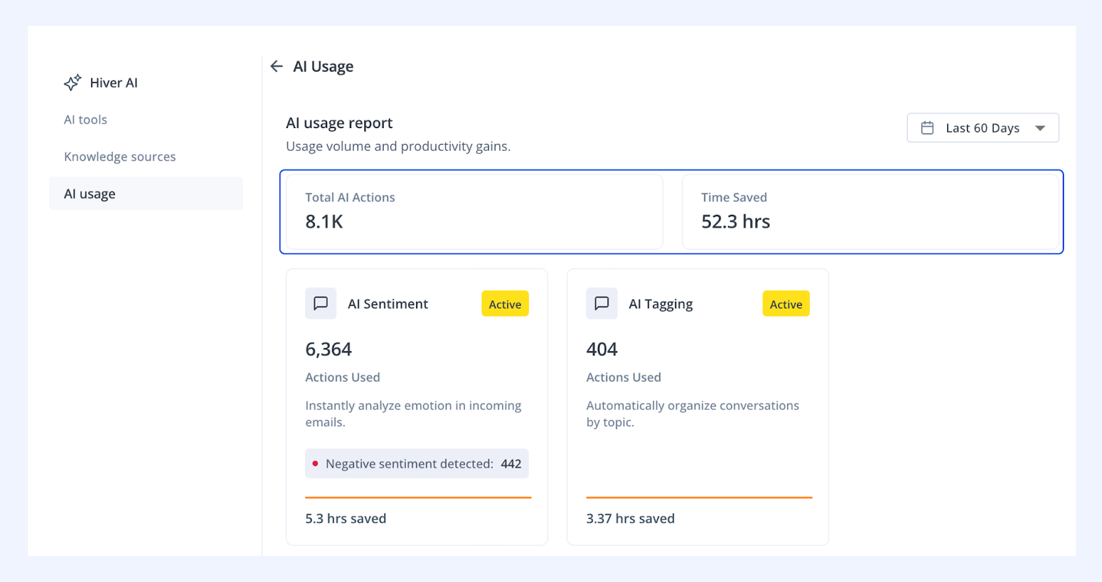
These top-level metrics give you a quick snapshot of Hiver AI’s usage across your team.
AI Actions: The total number of times your team used any Hiver AI feature during the selected timeframe.
Time saved: Total number of hours your team saved by using Hiver AI.
Feature-based metrics
This section breaks down usage and time saved by individual features:
For each feature, you can see:
- How often it’s used
- How much time it saved your team
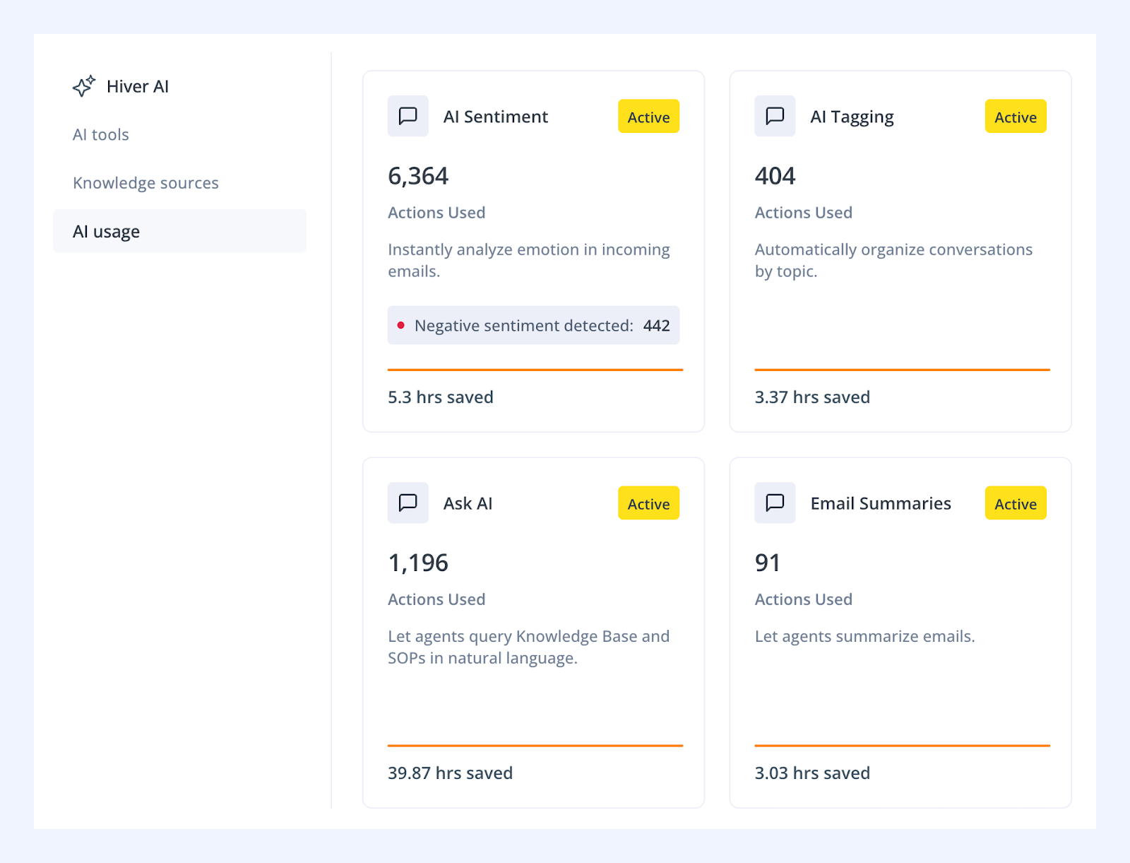
This makes it easy to answer questions like:
- Which AI features does my team depend on most?
- Where is AI delivering the biggest efficiency gains?
- Which features might need better onboarding or visibility?
How time saved is calculated
Time saved is estimated based on the average time it would take to complete a task manually. These values are then converted into hours to show total time saved:
| Feature | Calculation logic |
| AI Sentiment Analysis | (Count * 3 secs) / 3600 |
| AI Tagging | (Count * 30 secs) / 3600 |
| AI Compose | (Count * 120 secs) / 3600 |
| Ask AI | (Count * 120 secs) / 3600 |
| AI Summarizer | (Count * 120 secs) / 3600 |
Where Count = number of times a feature was used.
Total usage volume graph
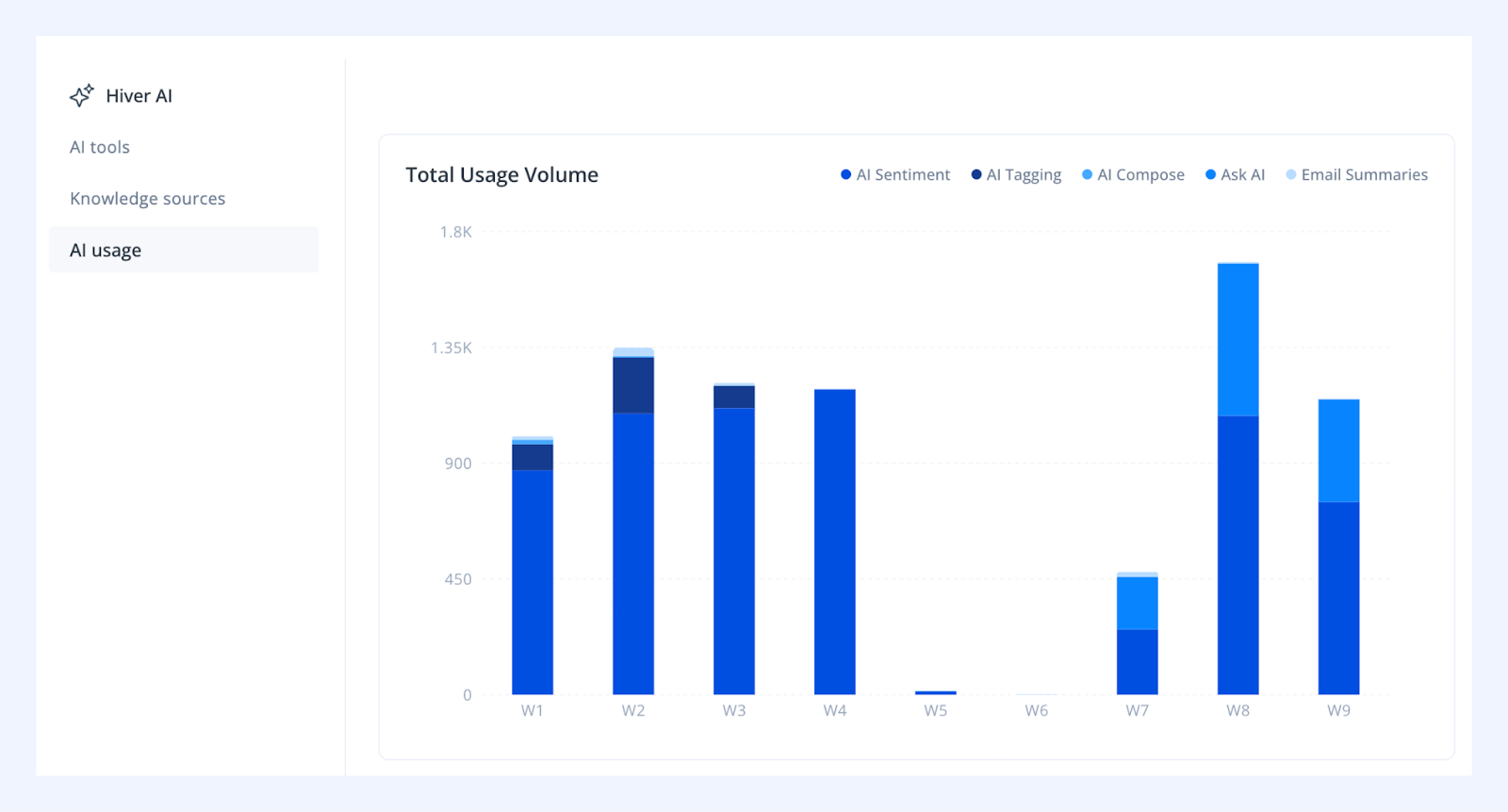
This section shows a bar graph visualizing how AI usage is distributed across features. Use this view to:
- Quickly spot dominant versus underused features.
- Understand team behavior at a glance.